This blog is for the students and the instructors (Professor John C. Henderson and myself) to continue the conversations on the role of information technology in modern corporations at Boston University. Please feel free to join the conversation by commenting on our posts and discussions.
Search This Blog
Tuesday, October 12, 2010
Information is Beautiful (and potentially useful) when Visualized
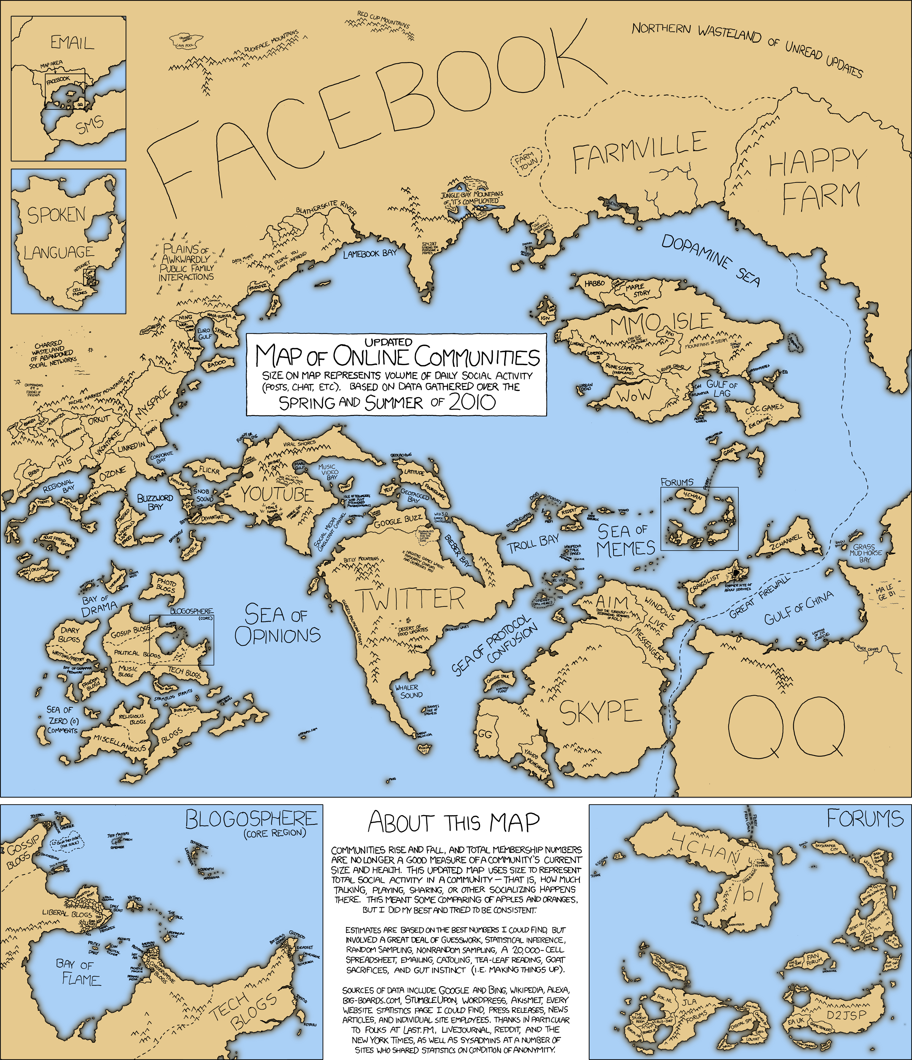
By now, we all know that information is beautiful and potentially useful when visualized.
Here are some that I thought you may find interesting.
I think visualizing information data will become a powerful concept in the following years. The main reason is that visualizing tools can increase data visibility and thus reduce people effort. I know Microsoft and Google have released these kind of tools in the summer. Even some phd and master in information management do research on the topic.
I have found visualization tools to be an excellent way to convey numerical information, from simple red-yellow-green "traffic lights" to color-coded geographical charts. They make decision-making that much easier. Check out this post for other cool visualization tools.


These are great.
ReplyDeleteTED from creator of the first visual above:
http://www.ted.com/talks/david_mccandless_the_beauty_of_data_visualization.html
An executive recommended the book Back of the Napkin which also makes the case for distributing information visually. I just wish I was better at it!
David:
ReplyDeletePost the link to the Back of Napkin. I think it complements this for sure!
I think visualizing information data will become a powerful concept in the following years. The main reason is that visualizing tools can increase data visibility and thus reduce people effort. I know Microsoft and Google have released these kind of tools in the summer. Even some phd and master in information management do research on the topic.
ReplyDeleteI have found visualization tools to be an excellent way to convey numerical information, from simple red-yellow-green "traffic lights" to color-coded geographical charts. They make decision-making that much easier. Check out this post for other cool visualization tools.
ReplyDeletehttp://www.smashingmagazine.com/2007/08/02/data-visualization-modern-approaches/